I’m interested in the methods we use to remember (or disremember) our past selves. In a digital era, we’re each constantly producing a steady stream of words and images that are recorded in our iCloud or on our Facebook timelines, for instance. A recent class speaker even suggested that our collective tweets may be permanently archived by the Library of Congress (but it’s still not a done deal). For this reason, I wanted to work with a body of data that serves as a digital artifact of my personal life. I wanted a way to frame the text against other events that were occurring in my life at the time.
For my first pass at this project, I chose to perform a simple text analysis on the texts I’d sent over the past year. I used a Python script to extract the information I wanted from my iMessage database (date + content of each message), analyze the sentiment of each message, and save the entire thing to a CSV.
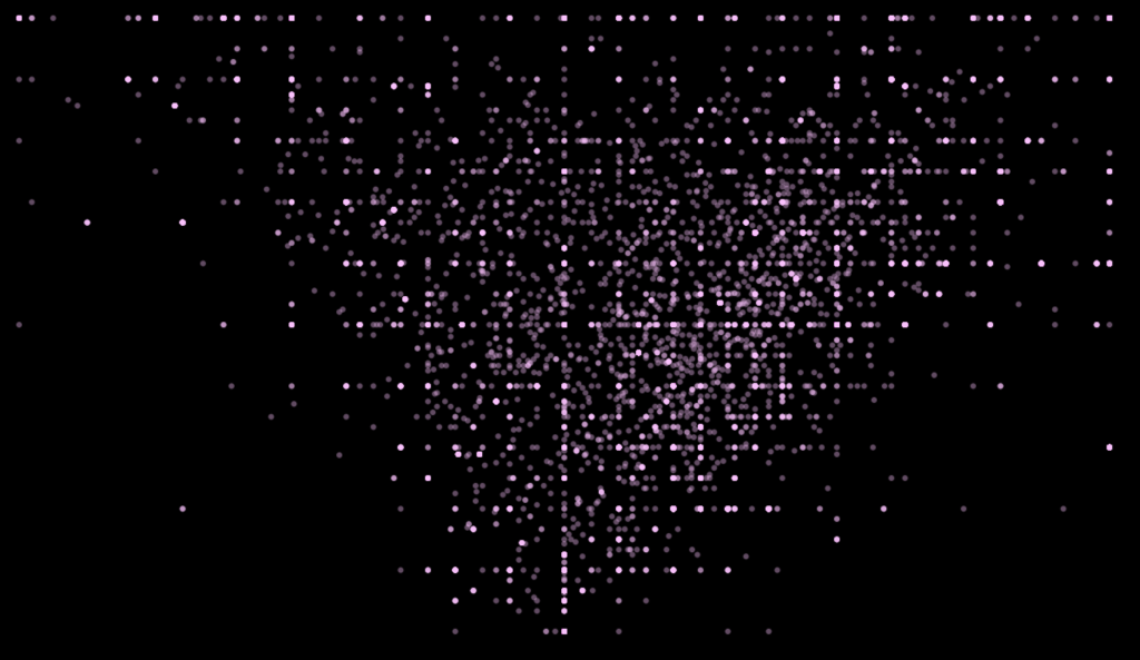
In Processing, I plotted the sentiment of each text (from -1.0 to 1) against the “subjectivity” of each text (i.e. was this actually something I was expressing about myself vs. about someone else). In the scatterplot, sentiment is plotted on the x-axis and subjectivity on the y-axis. The result:
After plotting the results of the text analysis, I discovered that there’s a correlation between the subjectivity and the sentiment of the text. The more subjective the text is, the more likely it is that the text has an extreme polarity, negative or positive. This makes intuitive sense; after all, the more emotional my texts are, the more likely they’re personal/subjective.
If I were to do a second pass at this project, I think I would have chosen not a perform a sentiment analysis of the text. Sentiment analysis can be notoriously inaccurate and I think that ultimately this graph doesn’t reveal anything particularly interesting about my communication style. I’d be more interested in seeing which words I use most often, or how my communication style changed over a period of time.

