Screen Shot 2016-05-09 at 4.34.25 PM

I attended a session at the Theorizing the Web conference last week about text-based online communities such as Reddit and 4Chan. Text-based communities are ones in which there is a reciprocal relationship between participants and a text: Community members both shape and are shaped by the words that are exchanged in the online conversation.

I’m interested in exploring the kind of language that is being used in subreddit communities. Using an API endpoint I found here and d3.js, I built a simple interactive graph that allows you to see which subreddits have been talking about a particular word in the last week.

See the full visualization here.

You can find the full repository here at GitHub. Some d3.js code below:

Screen Shot 2016-04-28 at 12.27.32 PM

Last week, I found data from The Health Inequality Project detailing the average life expectancy for people who live in various states in America, male and female. I took the information from that dataset and plotted it into an interactive map of the United States.

Check out the interactive map here. 

I’m still troubleshooting some problems with the tooltip, which allows users to hover over each state and display the data from that particular state. I seem to be having trouble pulling the data from the corresponding CSV.

You can see my full GitHub repository here.

Here is the full index.js code:

Screen Shot 2016-04-19 at 5.51.27 PM

For this week’s assignment, we were to use d3.js to create a simple graph. I decided to work with a data set I found at R Data Sets that included information about the highest points in national parks.

See the interactive graph here. 

I decided to start with a simple animation using the .transition() tool in d3.js. I also created two functions, mouseenter and mouseleave, that are triggered when you hover your mouse over each bar of the graph.

See my full code here.

And here is the index.js file:

Screen Shot 2016-04-06 at 6.58.20 PMFor this week’s assignment, we were to use SVG graphics and data from Gapminder to create a simple data visualization.

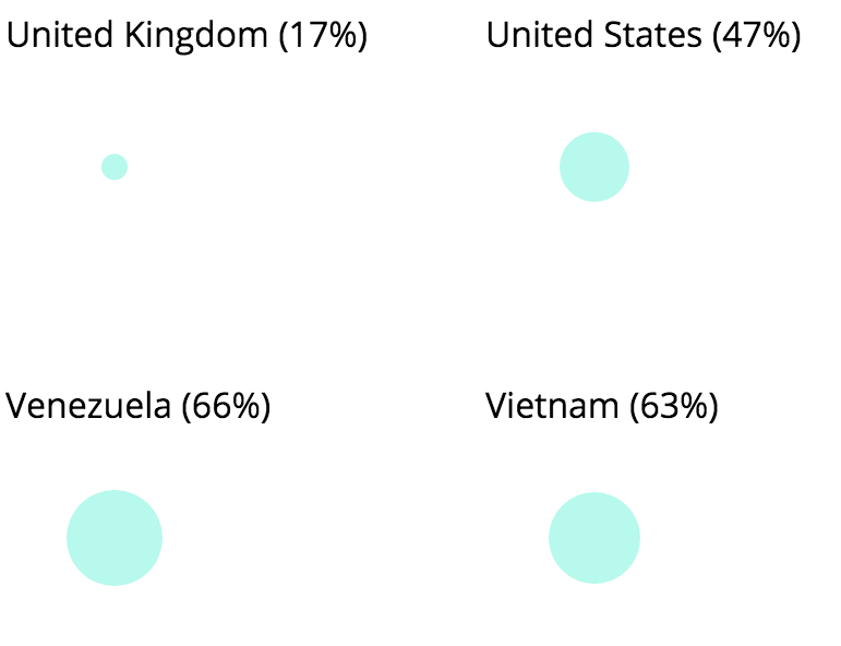
I created two simple data visualizations of this data set that shows, by country, private spend on health as a percentage of the total spending on health. Private health expenditure includes direct household (out-of-pocket) spending, private insurance, charitable donations, and direct service payments by private corporations.

The bubble chart

The first visualization was a bubble chart in which the size of each bubble corresponded to the percentage of the share (see it here). While I thought this method was visually compelling, I also felt that the information could be conveyed more accurately through a different visual. Instead of displaying the countries alphabetically, I thought it would be more informative to display them according to spend.
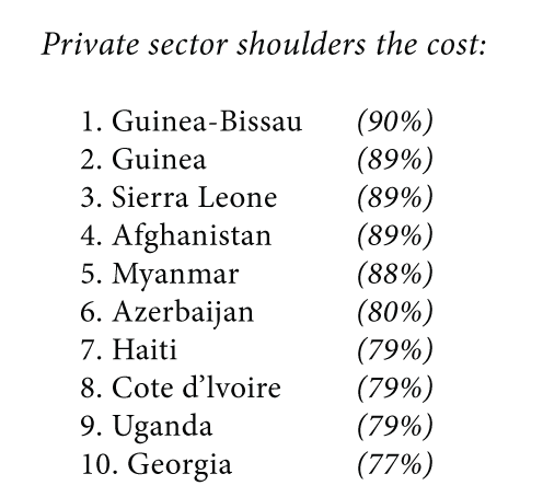
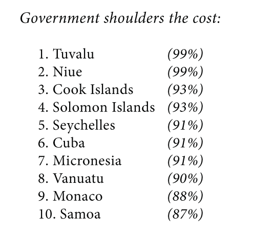
The bar chart

For the second visualization, I made a bar chart that showed the % private health spend for each country out of the total. I ordered the countries from those that had the highest private spending to the lowest. Check it out here.

Analysis

Visualizing this set of data gave me the ability to quickly compare private/public spend between countries and draw some conclusions.

private-1 spend-2

You can check out my full GitHub repository here.

Other (unrelated) thoughts

We were also asked to respond to a graphic/chart/visual from the website Wait But Why, a popular resource for explaining complex subjects in a simple way. I decided to look at an article that explains the history of Iraq and ISIS. I studied Arabic language/Middle East Studies in college and my undergraduate thesis explored neo-tribalism in Saddam Hussein’s Iraq so I was curious to see if the author of the article got the history right.

I was surprised – the author did a very thorough job explaining the last 100 years in Iraqi history, with particular emphasis on the factors that led to the rise of ISIS. The Sykes-Picot agreement, which is responsible for diving up Iraq and much of the Middle East, is summarized pretty accurately in these two maps:

Picot-Sykes-Agreement

border-problem-1024x785

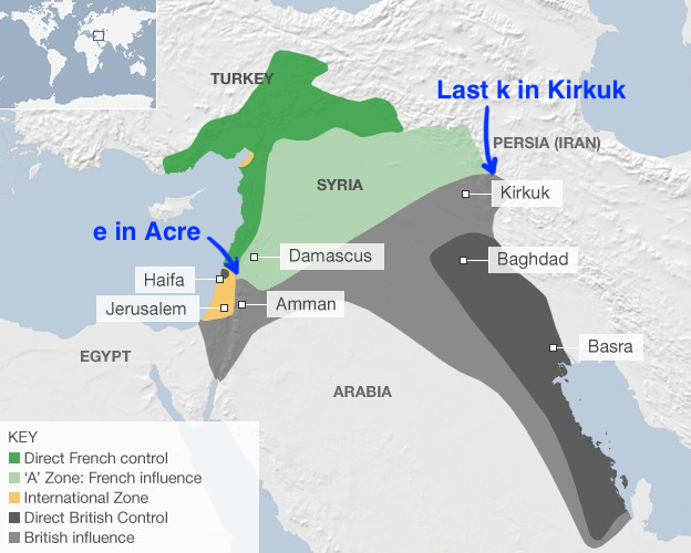
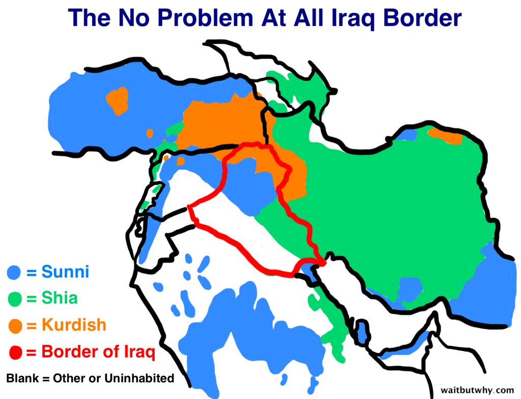
Source: Wait but why


Screen Shot 2016-03-30 at 4.06.17 PM

See my data visualization here.

For our first class assignment, we were to create a simple data visualization using a data source found on NYC Open Data, a repository of public data from various NYC organizations that is part of a broader initiative to make city data more accessible to the public.

I found a data set that is a directory of all the public toilets in public parks in New York. I decided to filter the data by borough and visualize the findings using the API to generate the json file.

Brooklyn appears to have more toilets in public parks than any other borough, but keep in mind that these are raw numbers. It very well may be the case that Brooklyn also has more public parks or larger public parks overall.

See the final data visualization here. You can check out my full code over at its GitHub repository.