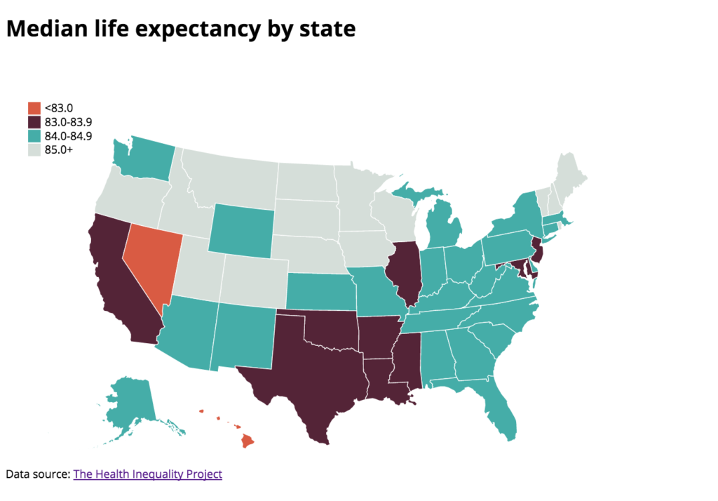
Last week, I found data from The Health Inequality Project detailing the average life expectancy for people who live in various states in America, male and female. I took the information from that dataset and plotted it into an interactive map of the United States.
Check out the interactive map here.
I’m still troubleshooting some problems with the tooltip, which allows users to hover over each state and display the data from that particular state. I seem to be having trouble pulling the data from the corresponding CSV.
You can see my full GitHub repository here.
Here is the full index.js code:
