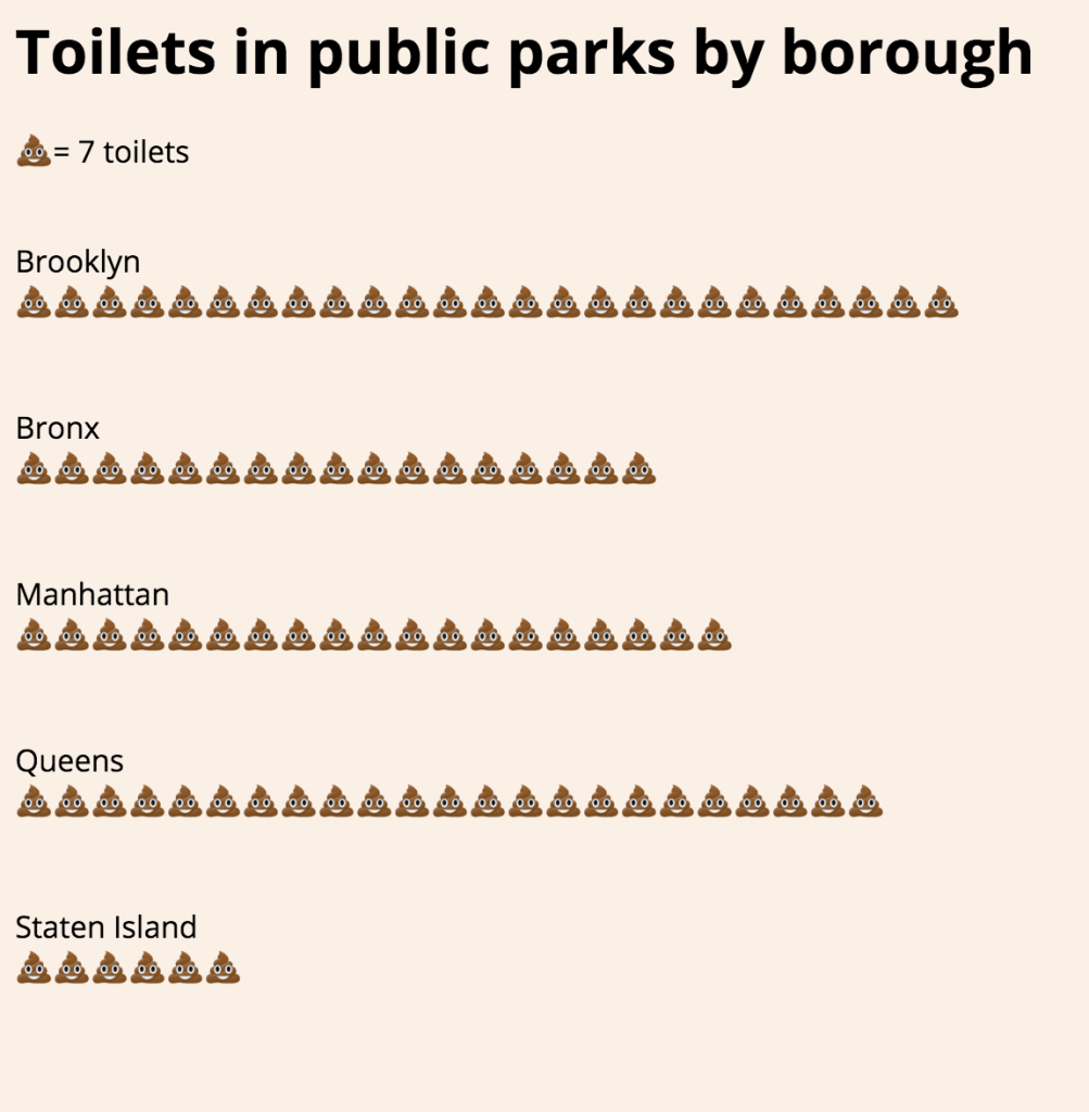
See my data visualization here.
For our first class assignment, we were to create a simple data visualization using a data source found on NYC Open Data, a repository of public data from various NYC organizations that is part of a broader initiative to make city data more accessible to the public.
I found a data set that is a directory of all the public toilets in public parks in New York. I decided to filter the data by borough and visualize the findings using the API to generate the json file.
Brooklyn appears to have more toilets in public parks than any other borough, but keep in mind that these are raw numbers. It very well may be the case that Brooklyn also has more public parks or larger public parks overall.
See the final data visualization here. You can check out my full code over at its GitHub repository.
