Last week, we designed a physical object that could function as a counter triggered by the end user. Inspired by the classic pomodoro timer, I prototyped a counter that required a twist to move up or down.
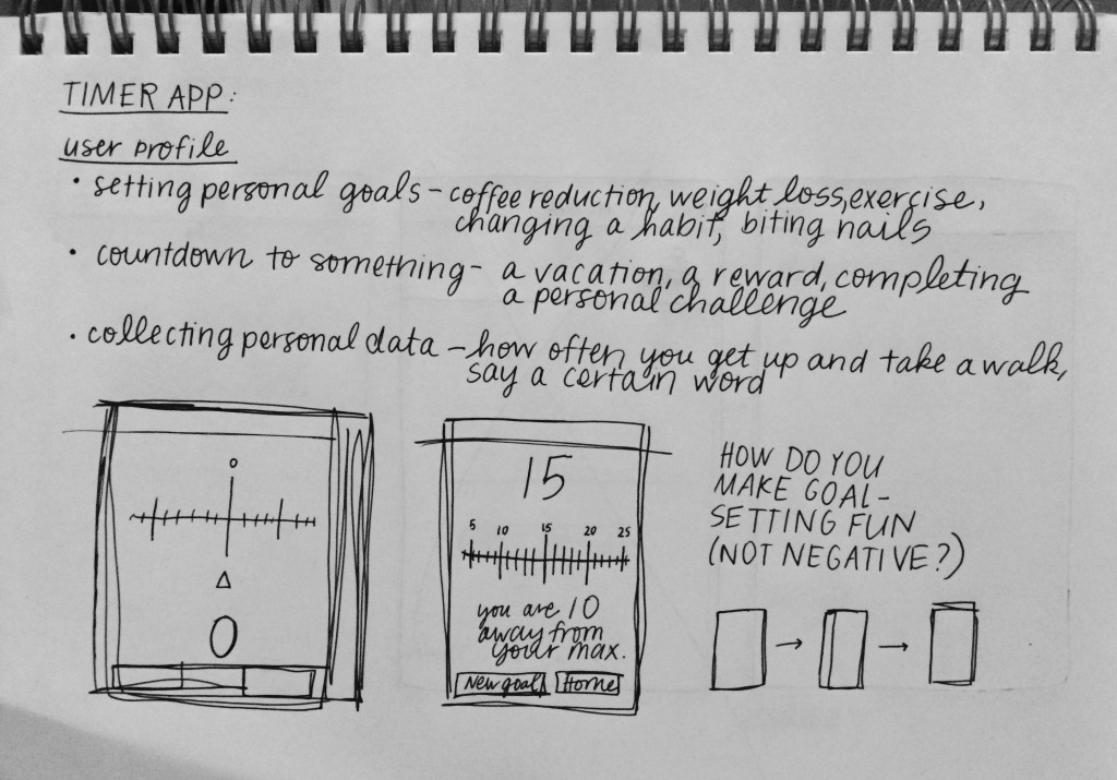
This week, I prototyped the app version of my counter with some wireframes. I started the design process by collecting my thoughts about the user of this app: Who is he or she? What would he or she be using this app for? What are the primary functions of this app?
I decided that I wanted to build an app that allowed the user to set simple numerical goals for herself and then track those goals over time.
I had a lot of ideas about how to make goal-setting a more positive experience. For instance, studies have shown that individuals are more successful at achieving their goals when they frame the experience as an accomplishment rather than a punishment. I thought about adding metrics so that the user could track his/her goals over time.
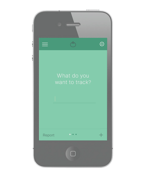
The app that I conceived has three major components: adding goals, tracking goals, and reviewing metrics. I wanted to make sure those tasks remained central and accessible at all times, so I decided to add a button on the bottom of the screen for “report” and a plus sign for adding a new goal. Here’s the design I came up with:
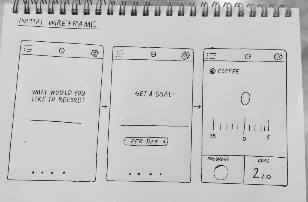
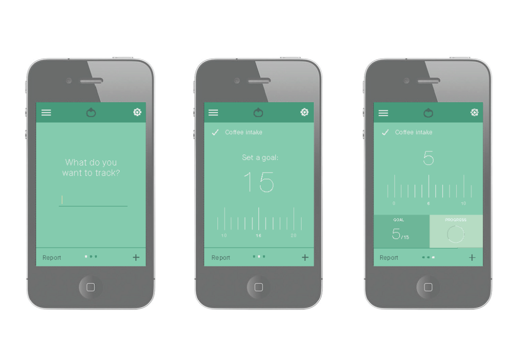 Here is the initial flow: When you open the app (or when you click the + button on the bottom right hand) the app prompts you to add a new goal. You enter the name of the goal, you input the number you would like to reach, and then you can track your progress.
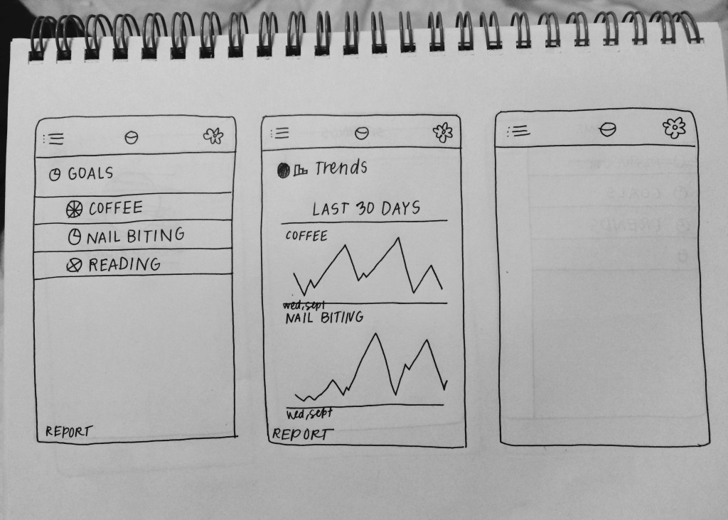
 If you click the menu button in the top left hand, this is what the flow would look like. You can set a goal, track a goal, or view overall trends over time.
