Screen Shot 2015-12-18 at 2.48.58 AM

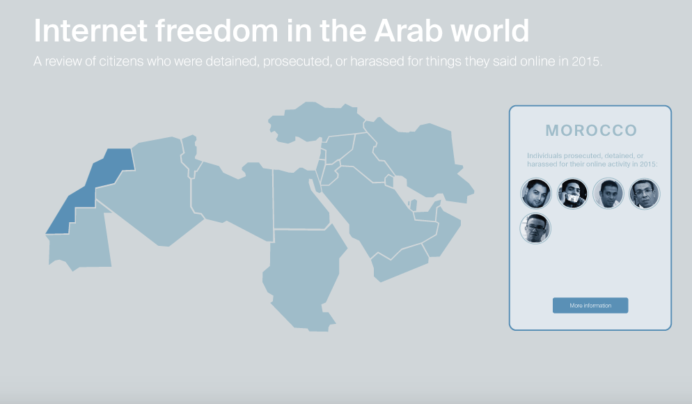
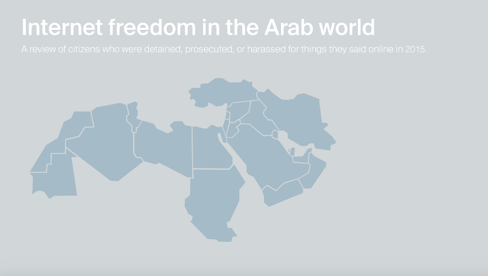
For my final ICM project, I created an interactive map tracking individuals in the Arab world who had been detained, prosecuted, or harassed by their governments in 2015 because of their online activity.

Check out the map here.*

Data sources: Committee to Protect Journalists’ 2015 report on jailed journalists | Global Voices’ Digital Citizen project

When I had initially proposed this project, I planned to limit the scope of my data to just imprisoned journalists. As I did more research, however, I decided to broaden the scope to include activists, outspoken citizens, bloggers, and others who are receiving lengthy prison sentences for expressing themselves online. In many cases, individuals are being arbitrarily detained without any clear accusations or charges.

THE DATA

The data for this project came from several sources. First, I combed through the data collected by the Committee to Protect Journalists in its 2015 report on jailed journalists. Second, I consulted Global Voices’ outstanding project Digital Citizen, a biweekly review of human rights in the Arab world. For every individual, I found at least one other piece of journalism online confirming the incident. The result was a long list of individuals who had been detained, prosecuted, physically harassed, or killed by their government between December 2014 – December 2015.

OVERALL TRENDS

Here’s what is most troubling: The number of individuals being targeted for their online behavior in the Arab world is increasing. According to Freedom House’s 2015 Freedom on the Net Report, in the past year there was a spike in public floggings of liberal bloggers, life sentences for online critics, and beheadings of internet-based journalists in the Middle East.

The report states that in the past year “penalties for online expression reached a new level of severity as both authorities and criminal groups made public examples of internet users who opposed their agenda.” In Egypt, for instance, two journalists received life sentences for their online coverage of a violent government crackdown on a Muslim Brotherhood protest.

arab-map

THE LEGAL CLIMATE

With this project, I wanted to explore the factors driving the boost in imprisonments and detainments for online behavior. Specifically, I was interested in how the legal climate and attitudes towards the internet in each of these countries contributes to the problem.

The adoption of sweeping cybersecurity and anti-terrorism laws in 2015 has been cited as one of the major causes of increased imprisonments. This year, Mauritania proposed two draft laws on cybercrime and the information economy that punish “insults” against the government with up to seven years in jail. Tunisia passed a counter-terrorism law that arbitrarily restricts freedom of expression. A new freedom of information act was passed in Sudan that legalizes government censorship. This year Egypt passed a number of cybercrime and anti-terrorism laws that criminalize broad online offenses, allowing the government to crack down on human rights activists. The Jordanian government broadened its legal definition of “terrorism” to include critics who “disturb its relations with a foreign state.” Kuwait adopted a controversial anti-terrorism law. Other countries in the region continue to enforce their cybercrime and anti-terror laws, including the U.A.E., which has been know to give the death penalty for defamation charges.

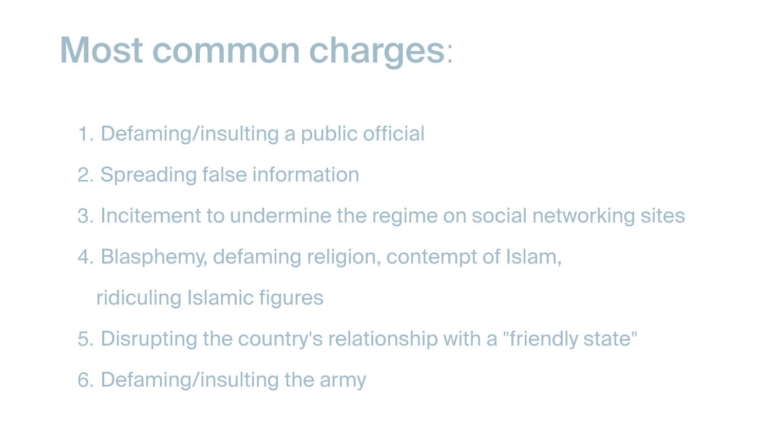
A quick look at the data suggests that these were the charges most often brought against individuals:

Untitled-1

I plan to continue investigating this issue in order to better understand why there has been an uptick in human rights abuses against journalists/internet users/bloggers/activists.

A WORD ABOUT THE DATA

*A major limitation of this data set: It is impossible to have a complete picture of human rights abuses right now. We do not yet have access to information about every detained or imprisoned citizen in the Middle East. For countries in which there is no rule of law (i.e. Libya and Syria), access to information about killings and detainments is limited.

I will continue to add additional individuals to the map as the media continues to report on human rights abuses that occurred in the past year.

Screen Shot 2015-12-09 at 6.33.23 PM

For my final project, I constructed an interactive wall that showcases the multiplicity of narratives surrounding women, their pain, and their conflicted relationships with emotion.

I asked several women in my life to record themselves talking about their relationship with sadness and grief. As you touch various points on the wall, it triggers audio clips from those interviews. You can see the progress of this project here and here.

Check out the video:

I was initially inspired by Charlotte Perkins Gilman’s short story “The Yellow Wallpaper.” Published in 1892, the story is written in the style of a diary of a woman who, failing to enjoy the joys of marriage and motherhood, is sent to live in a room alone in the country in an effort to “cure” her ineptitude. She wants to write, but her husband and her doctor forbid it. Confined to her bedroom, the patterns on the faded yellow wallpaper come to life for the protagonist and eventually precipitate her descent into insanity.

Here’s a sampling of some of the things that were said:

“I think there’s a stereotype in our culture that emotions are bad and they are weak.”

“I expect myself to push forward and to be better and to move on.”

“I’ve come up with this theory that it’s best to feel whatever emotion feels most urgent at that time and if it’s sadness then so be it. I think that sitting with sadness and getting to know its roots — it’s huge.”

For the fabrication of the wall, I covered a canvas with some vintage floral wallpaper from the 1920s. I liked that wallpaper is something we associate with domesticity, a quality and a space that has historically been associated with women.Screen Shot 2015-12-09 at 7.15.43 PM

As I mentioned last week, behind the canvas is a web of wires connected to the SparkFun Capacitative Touch Sensor Breakout driven by an I2C interface. The Arduino code was drawn largely from example code I found online at bildr for utilizing the touch sensor. Using what we learned about serial communication, I was able to connect a p5.js sketch that plays the appropriate audio interviews when the corresponding flower is touched.IMG_6809

After play testing the wall last week, I decided to also add LED lights behind each flower that turn off when you are touching them. I also added a pair of headphones in order to create an environment in which the participant/listener feels an intimacy with the speaker.

Overall, I was really happy with the quality of the audio that I got and the simplicity of the interaction. My friends and family who recorded themselves were generous and thoughtful. I think that came through when you listen to the audio.

Screen Shot 2015-12-09 at 7.18.12 PM

If I were to do this project again, I would change the fabrication of the wall to make it more elegant and beautiful. Right now the wall has a DIY feel – which I like – but if this were to become a real installation piece it would require some rethinking.

arab-world

For my final ICM project, I intend to design an interactive map that flags countries where freedom of speech is under attack. Taking data from the year 2015, I will show where journalists were imprisoned around the world.

Last year, the Committee to Protect Journalists (CPJ) published a comprehensive list of journalists who were imprisoned around the world in 2014 and their perceived offense against their country’s government.

Here is a test map of the MENA region that I began designing a few weeks ago. It’s based on data from Global Voices’ Digital Citizen bi-monthly newsletter about journalists who are imprisoned for the things they post online.

The broader question for me is about how the internet is being used in the Arab world. To no small degree, the spike in internet use and monitorial tools like Periscope and Twitter have empowered activists across the region to organize into collectives to fight abuses of power. The protests in Cairo’s Tahrir Square during the Arab Spring, for instance, were organized and promoted on simple social networks like Twitter and Facebook.

In a very optimistic 2005 academic paper “The Internet in the Arab World: Playground for Political Liberalization,” Albrecht Hofheinz suggests that the internet will expand the possibilities of what can be said in public spaces and usher in a new era of liberalization in Middle East countries. While we have witnessed major strides towards greater transparency and democratization in the region due to the internet, there is still a long way to go.

Most shockingly, in recent years the internet has been wielded as a tool for authoritarian regimes to discipline those individuals who are doing the very critical work of reporting human rights abuses as they are occurring. Not only is censorship at an all-time high in many of these countries, but many governments are seeking to pass new cybersecurity laws that would sanction the arrest of journalists speaking out against the government in online spaces.

With my project, I hope to not only visualize where these abuses are occurring, but I would like to give them a name and a face. I would also like to explore the legal statutes and cybersecurity laws that are governing how governments are using the internet in the Middle East. Are these actions sanctioned by the laws? Are lawmakers paying attention to the internet? How will the relationship between the Internet and the Arab world evolve in the coming years?

There are a few projects I will look to for inspiration:


The-Yellow-Wallpaper-1


“Pain is everywhere and nowhere. Post-​wounded women know that postures of pain play into limited and outmoded conceptions of womanhood…I know these dialects because I have spoken them; I know these post-​wounded narrators because I have written them. I wonder now: What shame are they sculpted from?”

– Leslie Jamison, “A Grand Unified Theory of Female Pain,” The Empathy Exams

For my final project in pcomp, I intend to explore the narratives we construct surrounding women, pain, and the erasure of the self.

My project was initially inspired by Charlotte Perkins Gilman’s short story “The Yellow Wallpaper.” Published in 1892, the story is written in the style of a diary of a woman who, failing to enjoy the joys of marriage and motherhood, is sent to live in a room alone in the country in an effort to “cure” her ineptitude. She wants to write, but her husband and her doctor forbid it. Confined to her bedroom, the patterns on the faded yellow wallpaper come to life for the protagonist and eventually precipitate her descent into insanity.

For my final project, I will construct a wall covered in yellow, faded floral wallpaper that participants can touch and interact with. When a participant touches an individual flower on the wallpaper, an LED will light up and an audio recording will play. The audio recordings are stories that I will record from women describing their personal experiences with love and pain.

I am still refining the conceptual piece of this project, which is requiring me to talk to many of my friends about what kinds of stories they would find most interesting. For now, these are the questions I’m considering:

  • Tell me about a time when you most felt loved.
  • How long will you let yourself be sad about something? Do you think there is an appropriate timeline?
  • Tell me about a time when you felt the most known.
  • Do you have any wounds from experiences long ago that you still carry around with you?

For the physical interaction, I will use conductive thread and wires behind the wallpaper to connect the center of each flower to a SparkFun capacitive touch sensor, which I have already tested out.

When the flower is touched, the audio plays and the LED turns on. When it is not touched, the audio and LED are off.

Schematic for hooking up the touch sensor:

52a0c354757b7fa13b8b456a

Here is a link my Bill of Materials (BOM), which is still being updated.

Here is my timeline.timeline


Screen Shot 2015-11-08 at 4.42.36 PM

Lately I’ve noticed something strange: Conversations about technology often locate themselves in the realm of the magical or the supernatural.

The sci-fi genre is replete with descriptions of machines that use language linked to animism, magic, witchcraft, the occult, and ghosts. In William Gibson’s 1984 sci-fi novel Neuromancer, the protagonist Case describes the posthuman body as “data made flesh,” a reference to Christian ontology and Jesus’ divine personhood.

These types of metaphors reaffirm one of the central assumptions at the core of the sci-fi genre: Breathing life into a machine is not far off from breathing life into a human body.

Similarly, the language used by today’s Silicon Valley tech kingpins reveals patterns in their thinking that link artificial intelligence to animism. “With artificial intelligence we’re summoning the demon,” remarked Tesla CEO Elon Musk in a 2014 MIT symposium. “You know those stories where there’s a guy with the pentagram, and the holy water, and he’s sure he can control the demon? Doesn’t work out.”

In a wonderful blog post entitled “Living with our Daemons,” Ingrid Burrington reminds us that Musk’s invocation of a metaphor to the supernatural is actually standard fare in the digital age. We’ve been living with so-called ghosts on the internet for a long time: Software wizards walk us through software installations, apps work “like magic,” and emails bounce back into our inbox from the mysterious MAILER-DAEMON. Evidently the tech world loves a good ghost story.

With that in mind, I decided to make a funny little game in p5.js in which users are prompted to “cast spells” on their internet enemies. Our assignment was to use some external media source in the sketch.

Check out my game here. 

Screen Shot 2015-11-08 at 4.36.43 PM

Screen Shot 2015-11-08 at 4.37.11 PM

The code for the game was fairly simple: I used dom elements to create buttons and capture video from a webcam.

Here’s the full code:

I’m satisfied with the way the project turned out. Here’s a video of someone (me) interacting with the interface:

Screen Shot 2015-10-27 at 1.01.55 PM

This week’s assignment was to create a sketch that employs an external data source. I had done this in one of my last assignments, where I was pulling data information from a CSV file to visualize the changing water levels in Lake Powell.

For this week’s project, I decided to work with the New York Times’ API to pull the NYT’s weekly Best Sellers list. I wanted to create a simple search so that users could see what the most popular books were on their birthday. Unfortunately, the API only allows you to pull data as early as 2008 but I decided to finish the project anyway.

See the final sketch here.

Before getting too deep into the project, I decided to make sure the NYT’s API was easy to use with ample documentation. Unlike the Goodreads API (which I’d spent a few hours playing around with), the NYT API is pretty intuitive and easy to use. It has a Best Sellers API that you can use after you’ve obtained the appropriate API key.

The URL that gets called each time a user searches is this:

http://api.nytimes.com/svc/books/v2/lists/overview.json?published_date=2012-11-18&api-key=f175980bb4d8913503354046d03a662b:4:56111762

Before writing any code, I had to construct the URL so that the input, which is a date (2012-11-18), gets wedged into the middle of the url.Screen Shot 2015-10-27 at 1.25.02 PM


Then in the function setup (), I created a button and a search bar. I also called a new function returnData() which pulls the data as soon as the mouse is pressed.

Screen Shot 2015-10-27 at 1.26.08 PM


The function returnData() constructs the URL as dataString and loads the JSON file. A JSON, or JavaScript Object Notation, is a programming language that parses and translates data into JavaScripts objects and arrays. The loadJSON() function takes two parameters: the URL (dataString) and what you’re telling the sketch to draw once you have the data (gotData).Screen Shot 2015-10-27 at 1.38.10 PM


Finally, the function gotData() is defined. Figuring out how to get the right data from the JSON file was tricky. The JSON file provides a series of objects and arrays nested in each other. There’s a lot of information to work with for each book: The title, the author, the publish date, an image of the cover, the price, the ISBN, the publisher, the contributor, the list, etc.

I decided I just wanted my function to pull pictures of the front covers of each book. To do so, I had to first create an empty array and push the URLs for the image into the new array. I printed the array to make sure it worked!

Next, I needed to use the p5.dom library in order to get the appropriate images from the URLs. I was introduced to the function createImg(), which creates images from the URL that appears in the parameter.Screen Shot 2015-10-27 at 1.41.11 PM


Screen Shot 2015-10-27 at 1.02.15 PM
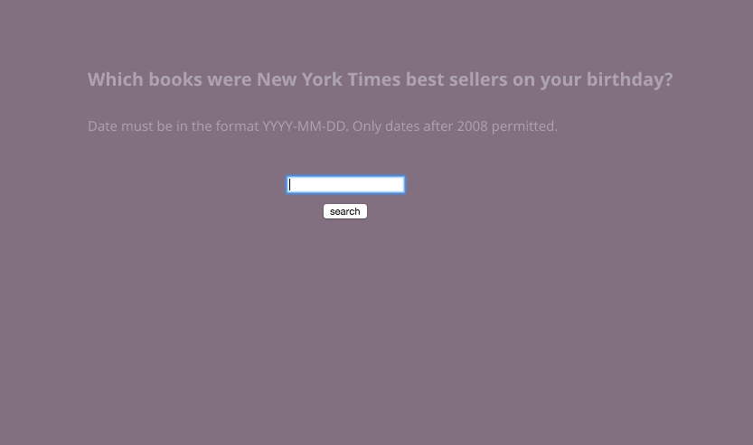
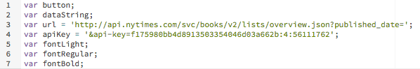
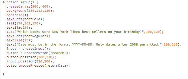
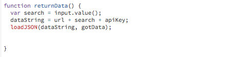
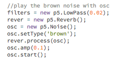
That’s it! I got the search working. There were several lingering issues with the sketch that I didn’t have enough time to resolve, namely:

  1. There are duplicate book covers. Because I didn’t specify which Best Seller list to display, it’s displaying all of them at once. As such categories like hardcover_fiction and ebook_fiction are going to have repeats.
  2. The book covers aren’t wrapping. The books appear in a straight line because we added ‘inline-block’ to the display style, but the books do not wrap in order to fit within the canvas.
  3. The dates only go back to 2008. This is the only data the NYT API provided.
  4. The input is awkward. Entering in a date with the format YYYY-MM-DD is unwieldy. I would need to create three dropdowns or inputs so that users could enter the date information more easily.

See my full code here.

IMG_2465

The aspirational version of my water harp.

The project I proposed last week was ambitious to say the least. In my project proposal, I stated that I wanted to build an entire interaction around the tactile experience of running one’s fingers through a stream of water.

In reality, there were a lot of obstacles I hadn’t anticipated encountering and I realized that the project I thought I’d be building required a longer time frame to test out ideas. I still love the concept but I will need to keep testing out the project before it moves forward.

Here’s what I built:

The (water) harp. from Rebecca Ricks on Vimeo.

That being said, I think I build something pretty cool even if it was only one piece of what I’d planned to build.

The initial plan.

After I nailed down the concept, I talked to Pedro about the different kinds of sensors that were available to me. We discussed some different potentiometers: photosensors, lasers, etc. Since I was really looking to build a series of simple switches, he suggested I keep things simple by using what is called an end switch. I decided that I wanted the water to fall on 10 switches. As the participant interacted with the water, it would trigger different sounds.

IMG_2473

Step one: Fold the plexiglass into a shape that would create a waterfall wall of water. 

I sketched out a few different ideas for the shape of the plexiglass. Ultimately I decided it would make the most sense to build a waterfall that would stand on its own and sit on a tabletop surface. Using the plastic heater, it was a laborious process to bend the plexiglass but I was able to get it into a shape that I liked.

IMG_2410

IMG_2413

Step two: Test out the waterfall with different configurations.

The initial plan was to set up a system whereby the water drips straight off the plastic into a container and is then pumped back up to the top and drips out a pipe with holes drilled in it. I set up the components – piping, pump, acrylic – and started testing the water.

IMG_2437

The result of my experimentation was extremely frustrating. It seemed like there were so many factors I had failed to consider when I’d decided to work with water. First of all, the water made a huge mess, which I hadn’t anticipated. More importantly, water has an affinity to plastic and acrylic and so I wasn’t getting the consistent blanket waterfall shape I’d planned on working with.

It seemed like everyone on the floor had ideas about hydrologics and water pressure. I tested out different materials for making a lip for the acrylic but nothing seemed to even out the stream.

Step three: Build the hardware components.

After three days of testing the waterfall, I decided to shift gears and begin building the actual switches and the circuits that would connect to the Arduino.

I laser cut some acrylic “keys” that would serve as an extension of the end switches, which the waterfall would be hitting. I also laser cut a board with ten holes to fit the switches. I soldered the switches to wires that led to the breadboard, which connected the 10 switches to digital pins 3-11.

IMG_2448

The wires were connected correctly and I knew I would need to figure out a way to protect the hardware from getting wet. That would prove to be a really important issue if I got the waterfall to actually work.

I did like the feeling of pushing on the keys. You can push them in a wave pattern, parodying the feeling of water falling on them. It felt sufficiently tactile and I decided that since I was in a time crunch, I would have to adjust my concept slightly to account for the fact that I still hadn’t figured out the best way to make the water fall evenly.

IMG_2461

Step four: Write the code and add the sounds in p5.js.

I tossed around a few different ideas for the types of sounds I wanted to play. I thought about playing funny noises, spooky noises, water noises, human voices, and various tones, but the piece of music I kept returning to was Richard Wagner’s Vorspiel (overture) from Das Rheingold, the first opera in his Ring Cycle.

The opening of the opera is a realization of emergence, of becoming as process. Wagner was obsessed with origin stories and stripping away stories to their mythic core. Unlike Beethoven’s chaos, Wagner’s music begins with a monotonous E flat, building into more and more complex figurations of the chord of E flat major, which is meant to mimic the motion of the Rhine River, which runs through Germany. The piece lasts 136 bars and approximately four minutes.

There is something very watery about the piece of music. In his book Decoding Wagner, Thomas May writes: “The swirling textures of sound readily transmit the idea of water rushing and complement the music’s quickening into life.”

I chopped up the overture into 10 distinct “parts” that would correspond to the 10 keys. The result would be a layering of sounds as you run your hands over the keys.

IMG_2458


In class on Thursday, we were introduced to the powerful dom library in p5. According to the p5 reference article about p5.dom, the library allows you to interact with HTML5 objects, including video, audio, text, and your webcam.

I was immediately interested in trying a first pass at making an interactive film in which the user could click a button to jump to another film. I knew that I wanted to make some kind of super cut using p5.dom.

Here’s an unfinished, unpolished version of my sketch. I’m still working on it.

I was inspired by the Bob Dylan music video for “Like a Rolling Stone” in which users could “channel surf” as different individuals sing the lyrics to his song. I also was thinking a lot about video artist Christian Marclay’s art installation The Clock, a 24-hour montage of hundreds of film clips that make real-time references to the time of day. The video clips are all tied by one thing: The presence of a clock and/or time. The result is an eerie, fragmentary portrait of what one day looks like in the movies.

clock2_2353636b

I also wanted to access the webcam in some way. I’m taking my cues from Paul Ford’s insanely well-written and lengthly Bloomberg piece “What is Code,” which accesses your webcam and automatically prints a PDF certificate of completion with your picture when you have completed the 38,000-word article.

With that in mind, I wanted to combine both ideas and build a photobooth. You can switch between disparate clips of characters using a traditional photo booth in different movies by clicking the button “span time.” You can press “play” or “pause” to stop the film:

movieButton = createButton(‘play’);
movieButton.position(700, 500);
movieButton.mousePressed(toggleVid);


f5ce8a5716220b4adbae524670be1ac1Photograph by Eric Rose.

In keeping with the general tenor of my physical computation projects, I will continue to look at creative ways to provoke interactions with water.

I want a lot of my future projects to be an exploration of cymatics – a subset of modal vibrational phenomena in which a surface is vibrated and different patterns emerge in some kind of medium (paste, liquid, water, etc). Cymatics is essentially a process by which soundwaves are made visible. I like the idea of measuring a person’s heart rate and then visualizing that vibration pattern in a liquid, for instance.

According to Andrew Defrancesco, the more I thought about this midterm project, though, the more I was struck by the delightful feeling of running one’s fingers through a steady stream of water. I want to build the entire interaction around that tactile experience.

So here’s my proposal: I plan to build a water harp. This is the initial sketch of the project:

IMG_2389

The harp will consist of a rounded plexiglass board that water flows over, creating a waterfall effect. The water will hit a series of 8 sensors (either moisture sensors, photosensors, or another conductive material). There will be a water pump that pumps up the water and brings it back to the top.

Each sensor will be paired with a sound of a different frequency that will play from the computer using p5.js. I’m still trying to decide what kind of sound will be best suited to this project. It could be a series of different noises triggered by each sensor (such as rainfall, thunder, rivers, etc). I was also thinking a lot about using human voices singing at different pitches that would then harmonize with each other.

When the participant runs his/her hand through the waterfall, it will create gaps in the water, triggering different sensors. Overall, I want the experience to be as tactile and delightful as possible.

85521.ngsversion.1422286517028.adapt.676.1Photograph by Michael Melford, National Geographic Creative

I’ve been living in Utah for the last six years, give or take, and my friends and I have spent a lot of time exploring southern Utah national and state parks.

One of the most iconic bodies of water in the region is Lake Powell, a reservoir on the Colorado River that straddles both Utah and Arizona. Lake Powell is best known for its orange-red Navajo Sandstone canyons, clear streams, diverse wildlife, arches, natural bridges, and dozens of Native American archeological sites.

Since its 1963 creation, Lake Powell has become a major destination for the two million visitors it attracts annually. You can see why we love spending time there:

10590510_10154540007750624_787829644479667926_nPhotograph by my friend Kelsie Moore.

10532870_10154540023060624_3323817325450871258_nPhotograph by my friend Kelsie Moore.

Lake Powell is the second-largest man-made reservoir in the U.S., storing 24,322,000 acre feet of water when completely full. The lake acts as a water storage facility for the Upper Basin States (Colorado, Utah, Wyoming, and New Mexico) but it must also provide a specified annual flow to the Lower Basin States (Arizona, Nevada, and California).

Recent drought has caused the lake to shrink so much, however, that what once was the end of the San Juan River has become a ten-foot waterfall, according to National Geographic. As of 2014, reservoir capacities in Lake Powell were at 51% and the nearby Lake Mead was at 39%.

Drought has really reshaped the Colorado River region. According to the U.S. Drought Monitor, 11 of the past 14 years have been drought years in the southwest region, ranging from “severe” to “extreme” to “exceptional” depending on the year. You can see how drastically the landscape has changed over the past decade by taking a look at this series of natural-color images taken by a the Landsat series of satellites.

This week in ICM, we’re learning how to use objects and arrays in javascript. I wanted to produce a simple data visualization that displayed historical data about the water elevation in Lake Powell since its creation in the 1960s. I also knew that I wanted to use some kind of organic sound in the visualization, exploring p5.sound library.

See the final visualization here.

Screen Shot 2015-10-08 at 11.59.52 AM

I found a database online that contained the information I needed and I created a CVC file that detailed the year in one column and the elevation values in another column.

At first, I envisioned an animated visualization that snaked across the screen and split into fractals as you cycled through each year in the database. I liked the idea of having the design mimic the structure of the Colorado River. Here was my initial sketch:

FullSizeRender

I started playing around with the code and was able to produce an array of values from the CVC file. For instance, I created an array “elevation[]” that pulled the water elevation value for a given year. I wrote some code that allowed me to cycle through the years:

Screen Shot 2015-10-08 at 12.01.54 PMScreen Shot 2015-10-08 at 12.02.06 PMScreen Shot 2015-10-08 at 12.02.23 PM

After getting the years to cycle chronologically, I made an animation of a white line moving across the screen. For each new year, I wanted to draw a bar extending from the white line that helped visualize how the water levels were changing from year to year.

I created a function Bar () and gave it some parameters for drawing each of the bars.

Screen Shot 2015-10-08 at 12.06.52 PMScreen Shot 2015-10-08 at 12.06.59 PMScreen Shot 2015-10-08 at 12.07.31 PM

After defining the function, I started the animation by typing bar.display () with the specified parameters under function draw (). The bars were now a new object.

Next, I wanted to add sound to the visualization. I thought about a few different organic sounds: rainfall, rivers flowing, thunder, etc. In the end, I found a field recording of a thunderstorm in southern Utah and I immediately fell in love with the sound.

Every time a new year started, I introduced a 20-second clip of the sound so that over time you can hear the rolling thunder. I added some brown noise to sit underneath the sound file and some oscillation effects.

Screen Shot 2015-10-08 at 12.16.06 PM

When a new year starts, a new sound file plays, layering over the last sound. When the visualization finishes, the sound disconnects.

Screen Shot 2015-10-08 at 12.16.14 PMScreen Shot 2015-10-08 at 12.16.21 PMHere’s a video of the visualization:

Overall, I liked how this sketch turned out, but I had some major problems with this visualization.

First off, I think that the data I obtained (water elevation values by year) told a much less dramatic story than I had expected. I realized as I was doing research for this blog post that during droughts, it’s not the reservoir levels that experience the most dramatic decline, but the outflux of water is reduced significantly. I think that if I were to do this project again, I would have spent more time researching the data set I wanted to use.

Second, I really didn’t love the simple animated graph I produced. Yes, it told the story in a straightforward way, but I really wanted to produce a fractal/river shape that was more visually compelling than just straight lines. I couldn’t figure out how to do it in time so I might try doing it for a future project.

I think that adding the sounds made this visualization much more interesting and I want to keep exploring the p5.soundLibrary for future sketches.